User Reza_N uploaded the image
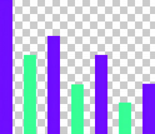
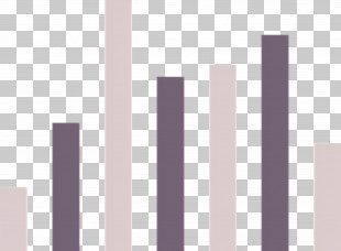
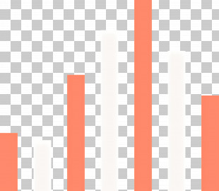
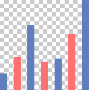
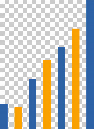
A bar graph that shows the number of people who have been diagnosed with cancer. The x-axis of the graph is divided into six bars, each representing a different age group. The bars are arranged in a horizontal line, with the highest bar at the top and the lowest at the bottom. The first bar on the left is a light purple color, while the second bar is a darker shade of purple. The third bar is white, and the fourth bar is light pink. The fifth bar is also light purple, and it is slightly darker than the sixth bar. The sixth bar is gray, and there are no other bars in the graph.
Bar Graph - Simple Bar Chart Illustration PNG
. The resolution of this PNG file is 2048 x 1756 pixels and it has a file size of 687.16 KB.A bar graph that shows the number of people who have been diagnosed with cancer. The x-axis of the graph is divided into six bars, each representing a different age group. The bars are arranged in a horizontal line, with the highest bar at the top and the lowest at the bottom. The first bar on the left is a light purple color, while the second bar is a darker shade of purple. The third bar is white, and the fourth bar is light pink. The fifth bar is also light purple, and it is slightly darker than the sixth bar. The sixth bar is gray, and there are no other bars in the graph.
You might also like...