User Yarva uploaded the image
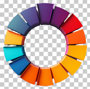
An illustration of a pie chart on a whiteboard. The pie chart is divided into four sections, each representing a different color - purple, orange, green, and red. The largest section is purple, the smallest is orange, and the largest is green. There are also several lines connecting the sections, indicating the percentage of people who have been diagnosed with cancer. On the left side of the pie chart, there is a blank space for the user to write their own information.
Chart - Colorful Pie Chart For Data Presentation PNG
. The resolution of this PNG file is 6252 x 6252 pixels and it has a file size of 2.51 MB.An illustration of a pie chart on a whiteboard. The pie chart is divided into four sections, each representing a different color - purple, orange, green, and red. The largest section is purple, the smallest is orange, and the largest is green. There are also several lines connecting the sections, indicating the percentage of people who have been diagnosed with cancer. On the left side of the pie chart, there is a blank space for the user to write their own information.
You might also like...